
In addition to my own films (Full Noon is going slow, but still going) I occasionally work on films made by other people. One of these is a horror film entitled The Wretched. When principal photography began a couple years back, I was unable to participate, but thanks to the loan of my microphone, I was credited as assistant producer. Some time after that, I volunteered to write the official novelization, based on the script, production stills, a trailer, and personal knowledge of some of the locations. It's technically done, and available to read here. Then, in 2016, reshoots happened. This time I was able to be there, and handled the camera for a good chunk of the shoots. Bundles of fun.
All of this leads to a couple of weeks ago, when director Nathaniel Davis contacted me about putting together a poster. Well, that was one of my favorite things, so I jumped at the task. Given a set of promotional images and the concept sketch below, I set off to work...

...and ended up with this.

The concept is simple: a poster for the protagonists' latest porn video (did I mention they're porn stars?) is disrupted when the wall on which it's resting is disturbed by an incursion from the villain of the piece. It wasn't intentional, but I realize now it was influenced by the poster for the horror classic (sarcasm!) Rumpelstiltskin.
After some notes from Nathaniel and a quick confirmation sketch from myself to make sure we were on the same page...

...we eventually got to a better design that's a) more its own thing and b) closer to Nate's original concept. Plus, the information on it is no longer copied over from Full Noon.
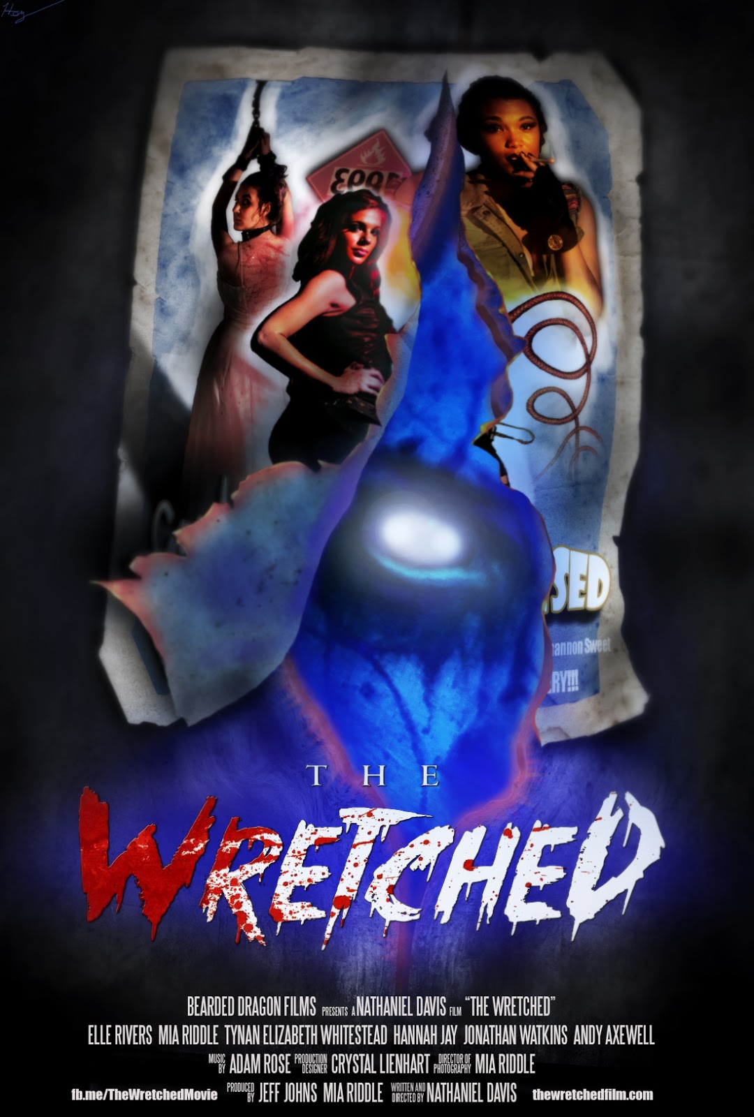
After that, Nate ran it through some filters to dirty it up a bit and make it seem like a weathered B-movie poster, as seen below. Hopefully, the final film will be out soon, and you can see this poster in all its cheesy glory on a VOD channel near you. For more information about The Wretched, please check out their awesome website.

One last thing: here's the poster for the in-movie porn (sadly designed too late to be used in-movie):

The title comes from the subtitle of the Marquis de Sade's Justine. And yes, I'm aware the hazard sign is backwards. It fit well with the character, especially juxtaposed with her smoking, and she worked better flipped the other way. Besides, it's a cheap porno poster; you really think the people making it (in-movie, remember) would care?
No comments:
Post a Comment